User activation across Google's ecosystem
Improving how users rediscover and return to Smallpdf across Google Chrome and search touchpoints.
Smallpdf is a global SaaS platform offering simple, reliable tools for working with PDFs. With over 18m+ monthly active users across web the product relies heavily on high-intent search traffic and repeat task-driven workflows.
Smallpdf’s Chrome extension and the Google search integration are two of our most visible entry points. While acquisition was strong, retention and conversion were low: many users completed a single PDF task and didn't return.
As part of the Growth team, I led the end-to-end product design across our Google ecosystem, including the Chrome extension, Google Search (SERP), Google Drive, Google Docs, Gmail, Google Scholar, and introduced AI workflows within PDFium.
I partnered closely with PM, Research, Data, Copy and Engineering to define strategy, streamline UX, and ship improvements incrementally.
Early results showed the redesigned integrations improved user retention by 38% and increased paying-user retention by 24%.

Employer
Smallpdf
Timeline
2023-2024
Role
Staff Product Designer
Our challenges
Business challenge
Smallpdf has 3M+ Chrome extension installs, but only a small fraction of users were active. The extension offered little value as it functioned mostly as a bookmark redirecting users to marketing landing pages. This resulted in:
-
Weak activation
-
Low retention
-
A large dormant user base
Our presence across the Google ecosystem was also limited:
-
Google search surfaced only a subset of our tools
-
Drop areas on the search result page were outdated
-
Beyond Search and Chrome, there were few touchpoints for users to re-discover Smallpdf
As a result, we weren't supporting users at the right moment or in the right context to help them complete their tasks.
User challenge
Users experienced a fragmented journey:
-
The Chrome extension offered no in-flow value, making it's purpose unclear after installation.
-
There was no guidance toward next steps, or related tools, leaving users with little reason, or opportunity to return.
Design goal
Transform Chrome and Google touchpoints from a passive acquisition channel into an active, value-delivering ecosystem by:
-
Improving activation
-
Reducing dormancy
-
Driving repeat engagement
-
Creating a consistent, reliable experience across all Google surfaces
Constraints
1. Chrome & Google ecosystem
-
Limited flexibility in Chrome and Google Docs frameworks, requiring us to work within predefined UI patterns and rules.
-
Strict Chrome Web Store and Google integration guidelines, restricting onboarding, messaging, and customization.
-
Uneven capabilities across Google surfaces, preventing consistent levels of interaction or tool discovery.

The diagram above illustrates the main Chrome integration surfaces & flows
2. Technical
-
No full Chrome extension rebuild, as engineering investment was intentionally minimised.
-
Dependence on PDFium performance updates, affecting document reliability and processing speed.
-
Desktop-only support as the Chrome extension isn't available on Android or iOS, limiting mobile activation opportunities.
3. Cross-team
-
Close coordination with PM, Research, Engineering, Data, and Copy, making sequencing and alignment essential.
Overview of my design process

01 Kick-off & Alignment
I start any new project with a full-team kick-off to establish shared understanding and direction. Together, we clarify the goal, discuss what we believe we’re building, and align on success outcomes for both the business and users.
We surface open data and research questions, then dogfood the existing Chrome extension (CE) and Google Search (SERP) experiences. This makes key issues immediately visible and helps ground the team in the current state.
During this session, several problems became clear:
-
No in-flow value in the Chrome extension
-
Outdated tool coverage across both CE and SERP
-
Outdated visual design that no longer reflected our brand
.webp)
Miro snapshot of the existing CE and SERP flow
02 Data & Discovery
After aligning on goals, I partnered with our PM to review existing data: usage patterns, drop-off points, returning-user behavior, and Chrome extension install activity. This gave us an initial view of where activation was breaking down.
To deepen our understanding, I ran continuous discovery interviews with two groups of users:
-
those who had recently installed the Chrome extension
-
those who had the extension installed and had used it within the last 14 days
These conversations helped us uncover intent signals, expectations, and points of friction across CE and SERP. We also invited engineers to observe sessions live to build shared empathy and accelerate alignment.
Insights from discovery made it clear that users weren’t receiving meaningful value during their workflow and often struggled to re-discover Smallpdf when returning to PDF-related tasks.
.webp)
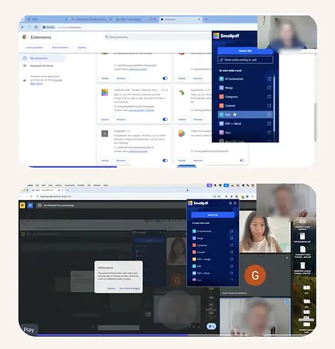
User interview participants during continuous discovery interviews (blurred for anonymity)
03 Design & Iteration
My approach to redesigning the Chrome Extension started with a clear goal: increase its in-product value so users had a meaningful reason to return. Insights from discovery shaped a set of user and functional requirements that guided the design direction.
Supporting the full workflow
The extension needed to handle the complete PDF journey: upload, edit, and download, without redirecting users to a marketing page. This created continuity and reduced drop-off.
Making task initiation intuitive
Ideally users could drag-and-drop documents so they could start work directly in the extension, mirroring the behaviour of our core tools.
Modernising the visual identity
The existing UI relied on outdated styles and inaccessible colour conventions. I aligned typography, spacing, and interaction patterns with our refreshed brand system to improve consistency and accessibility across surfaces.
Reducing cognitive load
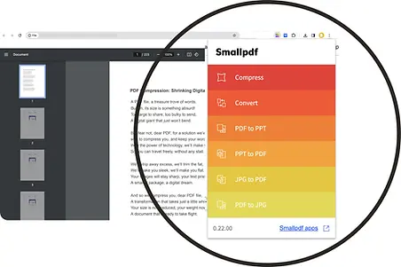
The previous “rainbow” tool list surfaced too many scrollable options at once. We focused the menu on the seven most-used tools to help users move faster and avoid unnecessary complexity, guided by Miller’s Law.
Improving contrast and visibility
Since most users browse in light mode, we introduced dark mode as the default. It provided stronger contrast and helped the extension stand out visually within the browser.
These principles guided several rounds of iteration with PM, Engineering and Copy. Once the direction was solid, I built a Figma prototype to validate the experience through user testing.
%20(1).webp)
Original Chrome Extension UI
.webp)
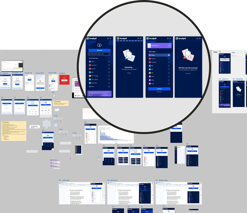
Snapshot of design iterations explored during the redesign process
Key decisions & trade-offs
-
Prioritised workflow completion and clarity over exposing the full tool set, accepting reduced breadth in exchange for stronger activation and retention.
-
Introduced a guided, multi-step flow, trading initial familiarity for better long-term confidence and feature discovery.
-
Shipped improvements incrementally, rather than rebuilding the extension, to validate impact quickly within technical constraints.
04 User testing
Once the core concept was defined, I created a high-fidelity Figma prototype to validate the redesigned Chrome Extension experience with users before development.
I tested the prototype with a mix of recently active users and loyal, high-volume users across industries such as real estate, marketing, and education. These users rely on the extension for frequent, mission-critical tasks, where security perception, compression quality, and efficiency matter most.
The interviews focused on three areas:
-
Workflow Integration and ease of start
How easily users could initiate tasks and integrate the extension into their repetitive workflows. -
Intuitive tool selection
Whether the simplified tool set supported their most common actions without friction. -
UI clarity and confidence
Whether the redesigned UI and multi-step flow (Extension → Select tool → Upload → Action) felt clearer and more supportive than the previous landing-page approach.
Overall, testing confirmed the redesigned extension felt more purposeful, easier to use, and better aligned with the needs of high-volume users, giving us confidence to move into development and experimentation.
.webp)
User interview participants during user test (blurred for anonymity)
High-fidelity Figma prototype with connected flows used during user testing
.webp)
05 Measure & Learn
After launch, we validated the redesigned Chrome Extension through a combination of A/B testing and behavioural metrics, focusing on activation, engagement, and retention rather than surface-level usage alone. We measured how users interacted with the new workflows compared to the previous experience, paying close attention to:
-
extension usage frequency
-
task completion across multiple tools
-
retention and re-engagement over time
-
signals of value recognition, such as click-through at high-intent moments
What we learned
-
Users were more likely to return when the extension supported complete workflows, not just single actions.
-
Guiding users through tool selection increased confidence and reduced early drop-off, even with an added step in the flow.
-
Re-engaging dormant users surfaced a natural self-selection effect: some opted out, while others became meaningfully active again.
Results
+38%
User retention
More users returned for additional workflows after the redesigned extension and improved Google touchpoints.
+24%
Paying user retention
Engagement increased, reducing trial cancellations when paying users discovered two or more PDF tools.
5x
SERP tool usage
Usage increased fivefold after improving the design of search placements and tool surfacing.
2x
Extension usage
Engagement doubled when contextual prompts were introduced at high-intent moments.
+CTR
Increase in clickthrough rate
More users clicked integrations at high-intent moments, indicating clearer value recognition.
4.6*
Average user rating
Rated 4.6 out of 5.0 across both the Chrome Web Store and Google Workspace Marketplace.
Together, these improvements increased activation, reactivation, and long-term engagement across the Google ecosystem.
We also saw an early rise in uninstalls, which aligned with expectations as dormant users that didn't need Smallpdf anymore were re-engaged and naturally opted out.
Chrome webstore user reviews
“Can't find a bad thing about this tool, it exceeds the expectations in every aspect. The built-in PDF AI chat bot is marvellous, great job you guys!!!'”
-Hans M.
“I will only want to use this app after trying a few others. Excellent and helpful.”
-Ky
"Extremely seamless, intuitive, simple but with enough features that even the free version allowed me to do what I needed. Which was important because it was time sensitive pertaining to legal matters. 5/5 no sweat."
-Dylan N.